昨天某技术群讨论的一道css题挺不错的,说的是同一个div鼠标从不同方向划过展示不同的效果,
效果预览如下:
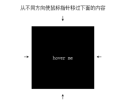
工具录制的gif图,有些卡顿
浏览地址看这 :http://output.jsbin.com/qixomayeqi
第一眼看这感觉是js实现的吧,后群里集思广益,发现css也可以实现的,方法就是用了四个div定位在容器的四边,当你鼠标滑过时让div显示出来就行,挺有意思的
让我们看看是怎么实现的,来点击more查看详情吧
css代码如下
1
2
3
4
5
6
7
8
9
10
11
12
13
14
15
16
17
18
19
20
21
22
23
24
25
26
27
28
29
30
31
32
33
34
35
36
37
38
39
40
41
42
43
44
45
46
47
48
49
| body{text-align: center;}
.box{
position: relative;
display: inline-block;
vertical-align: middle;
width: 200px;
height: 200px;
text-align: center;
background-color: #000;
color:#fff;
overflow: hidden;
}
.box-contact{
position: absolute;
width: 100%;
height: 100%;
line-height: 200px;
}
.box-hover{
position: absolute;
z-index: 1;
width: 100%;
height: 100%;
opacity: 0;
transition: all .3s ease;
}
.box-hover:first-child{
background-color: #f00;
top:-90%;
}
.box-hover:nth-child(2){
background-color: #0f0;
left:90%;
}
.box-hover:nth-child(3){
background-color: #00f;
top:90%;
}
.box-hover:nth-child(4){
background-color: purple;
left:-90%;
}
.box-hover:hover{
opacity:1;
top:0;
left:0;
}
|
html如下
1
2
3
4
5
6
7
8
9
10
11
12
13
|
   <p>从不同方向使鼠标指针移过下面的内容</p>
   <p>↓</p>
   <span>→ </span>
<div class='box'>
  <div class="box-hover">1</div>
  <div class="box-hover">2</div>
  <div class="box-hover">3</div>
  <div class="box-hover">4</div>
  <div class="box-contact">hover me</div>
</div>
  <span> ←</span>
  <p>↑</p>
|